Cabana
All-in-One Services App
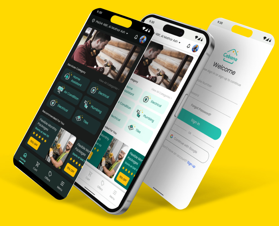
An app that provide assistance services to their users at their location.
UI Designer, Developer, Project Manager
3-4 months
The Challenges
- An existing app outdated in terms of design, features, and accessibility.
- Currently, there is a lack of a comprehensive app that integrates all booking services for users.
- Presently, vendors face a challenge of not having a singular app that enable them to offer all their services in one centralized platform.
- The presence of usability barriers inhibits smooth and intuitive user experiences.
The Solution
- Develop a comprehensive, all-in-one platform that facilitates both users and vendors in booking and selling services across diverse sector.
- Implement a web-based application that ensures convenient access for users from any location.
- Employ a user-centered design approach to enhance usability, catering to users of all age groups.
The Process
Emphasize
Define
Ideate
Prototype
Test
The Research
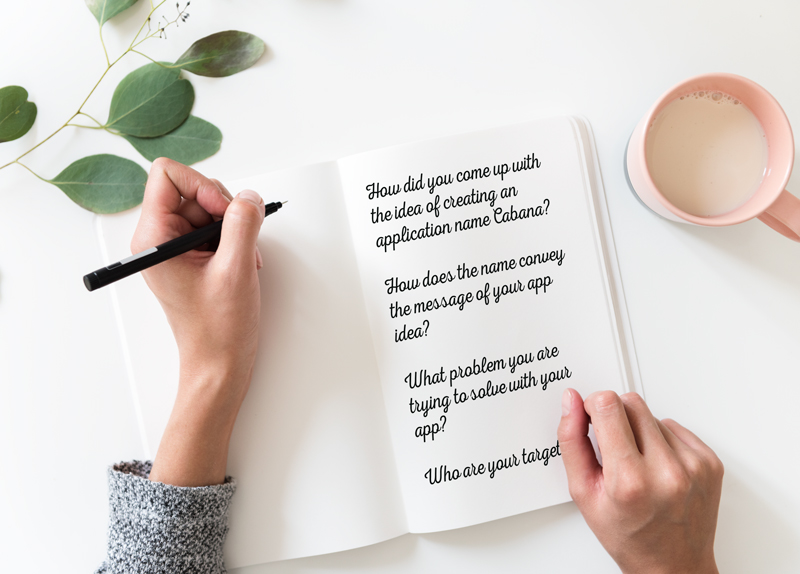
- The Questionnaire
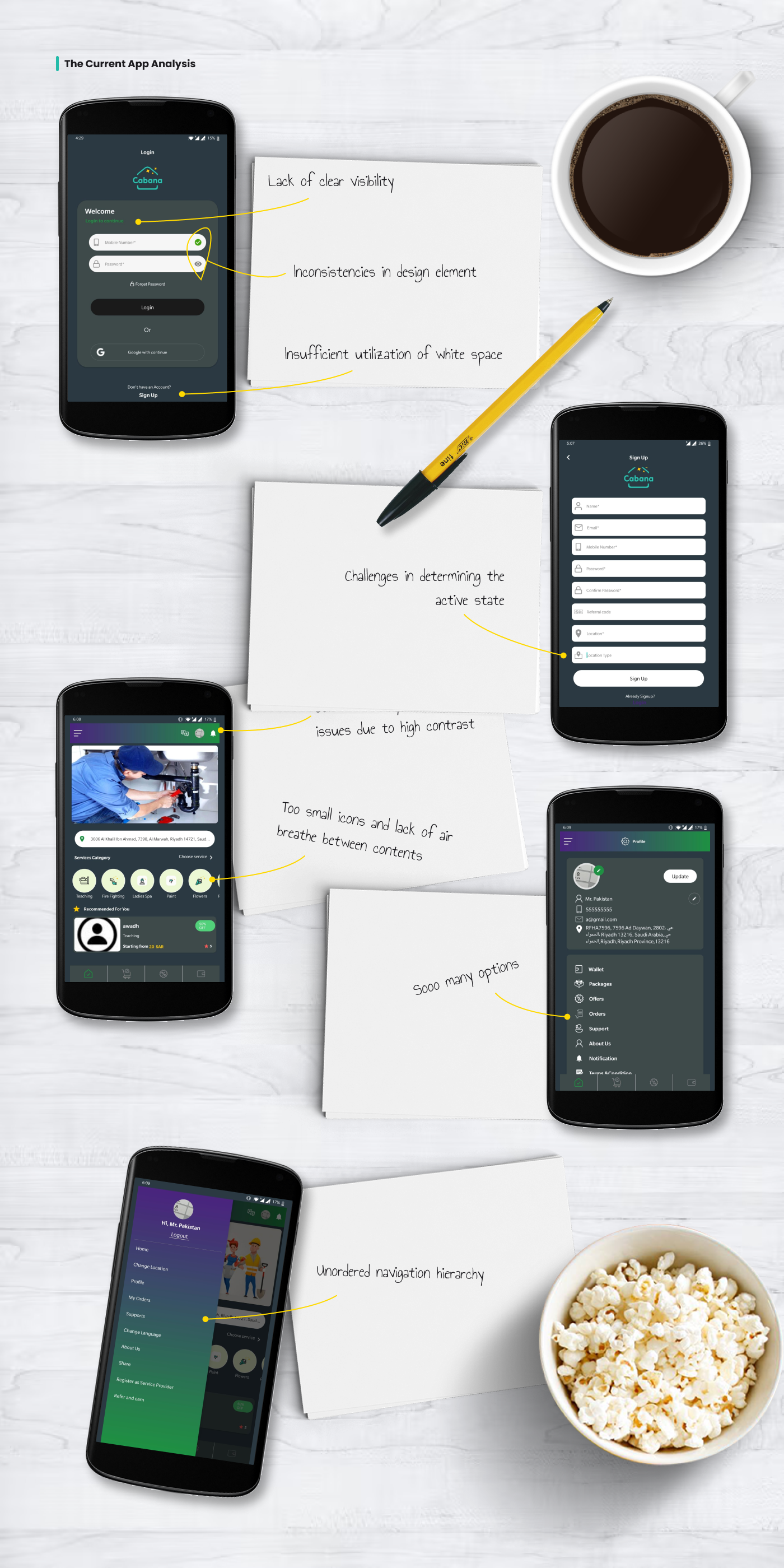
- The Current App Analysis
- The Competitor Audit
The Competitor Analysis
I downloaded three apps and then analyzed them, two of them are direct competitors and one is the existing Cabana app. I experience the existing and competitor products as a first time user perspective and analyzed the journey of completing a task in all the apps.
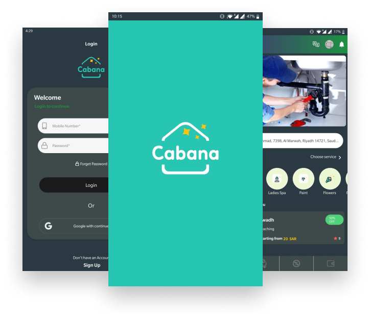
Cabana Existing App
The Good
- Offer vast variety of services compare to their direct competitors.
- Support native app for both iOS and android.
- Support Arabic and English language.
The Bad
- The app design is outdated
- Lack of features and inconsistency
- The user experience is not good as it’s challenging to complete the task and figuring out the navigation.
Albaap – Direct Competitor
The Good
- Clean and modern design
- Support mobile native app
The Bad
- The website is quite slow to start
- The site is not mobile responsive
- The service cost is quite expensive compare to other direct competitors
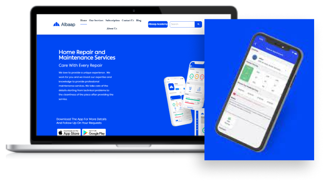
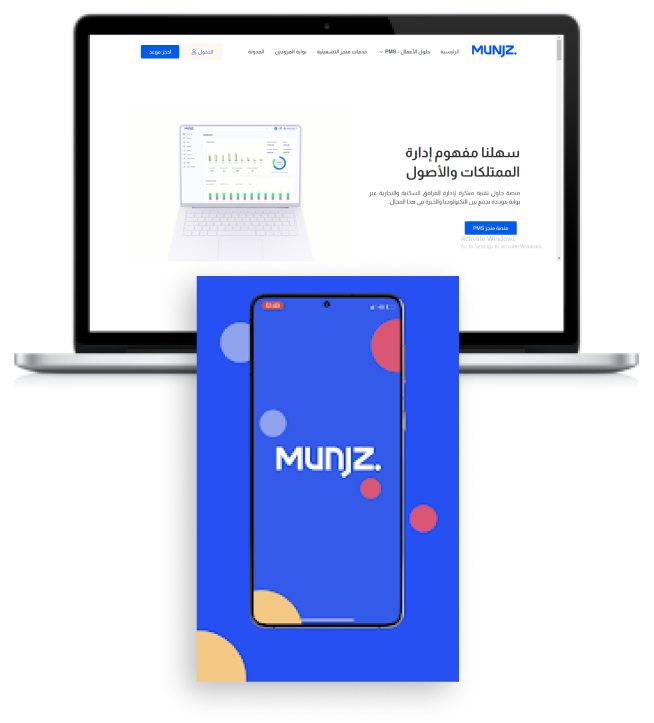
Munjz – Direct Competitor
The Good
- The website is very well structured and designed with modern, simple, and good colors contrast visibility.
- Support native app.
- The information provided are very well crafted and explained.
The Bad
- The site doesn’t support English language (at least I couldn’t able to find English option, I’m non-Arabic speaker).
- Target only Arabic speaking customers.
- The subscription feature does nothing, it just take you back to contact us page.
The User Survey
I conducted a survey among users who use home services app with a tracking system on a regular basic on Facebook.
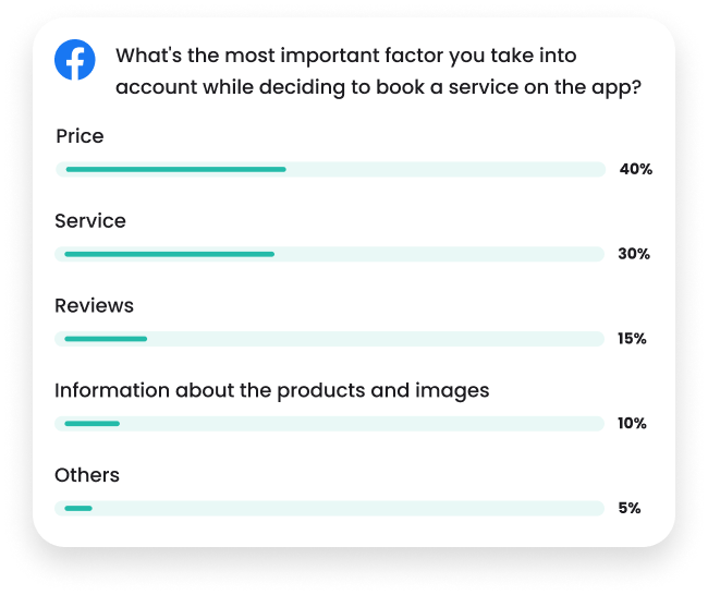
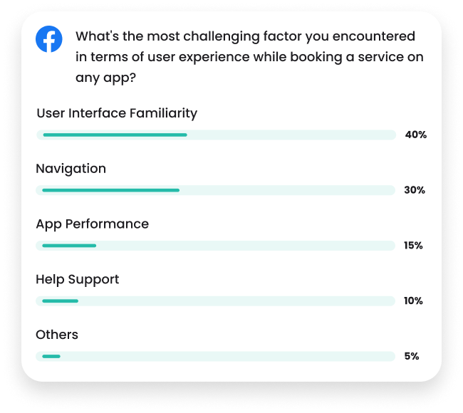
I then asked to use Cabana existing app and then I monitored their interaction journey experience with the product.
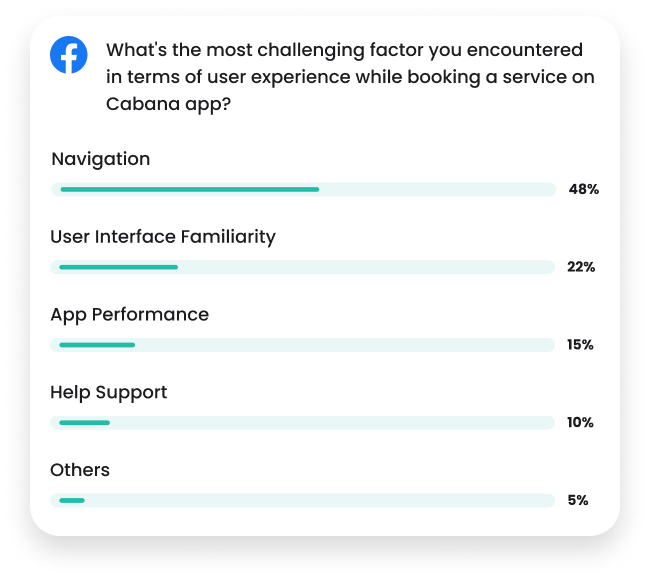
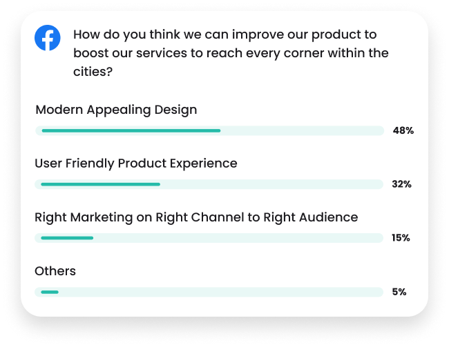

The Initial Research Results
As the carried out research shows, there is a clear need of restructuring app navigation hierarchy and user interface design in the existing app.
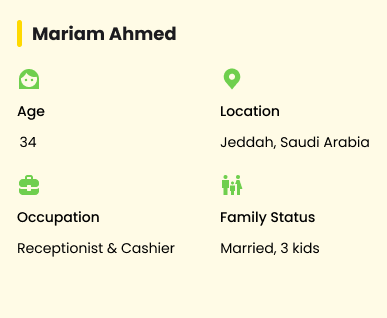
User Personas
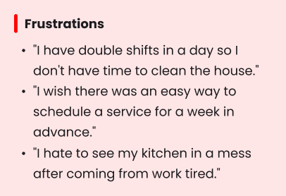
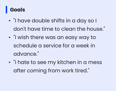
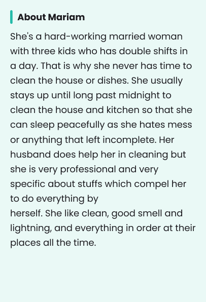
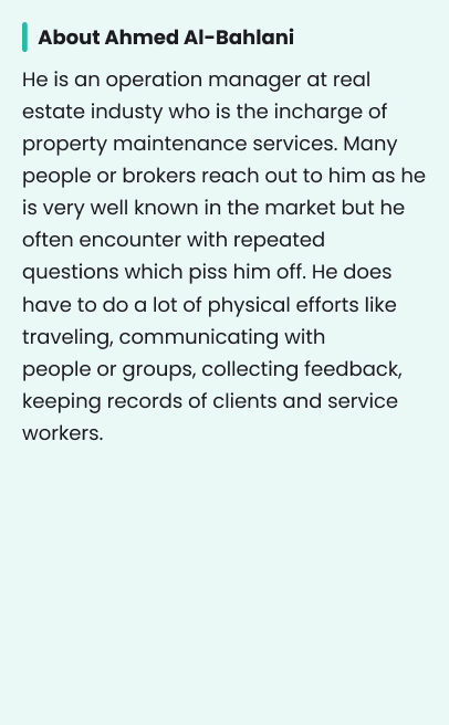
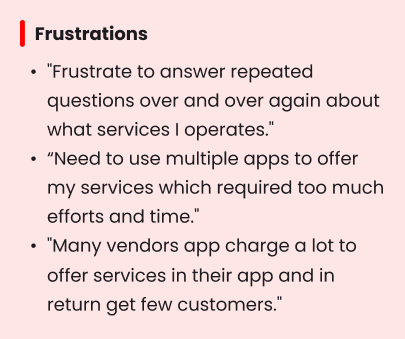
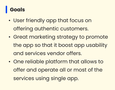
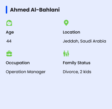
I created two personas to help me explore the needs of a larger group of users and design the app with specific target users in mind.


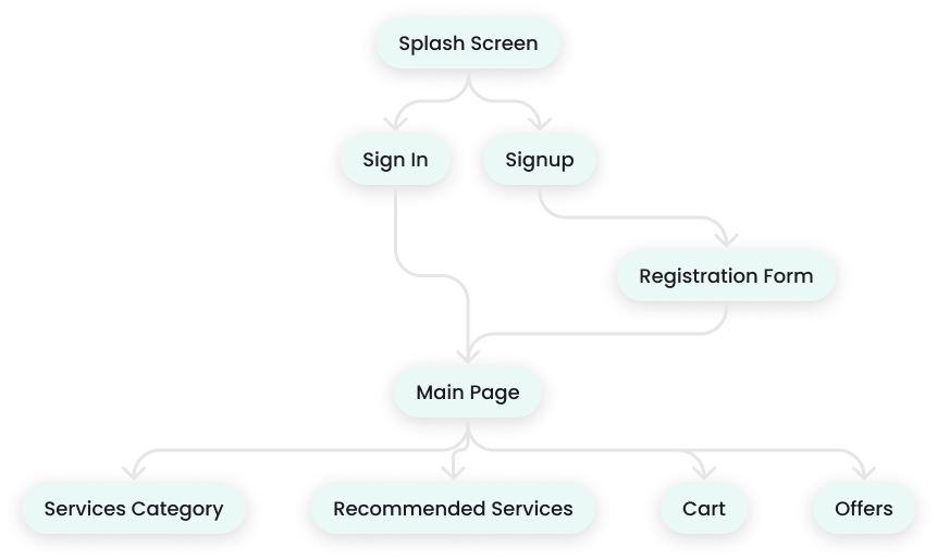
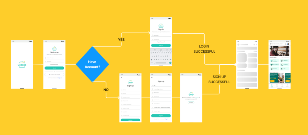
User Flow Chat: From Splash Screen to Main Page
User Flow Hi-Fidelity Chat: From Splash Screen to Main Page
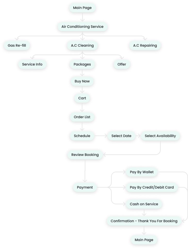
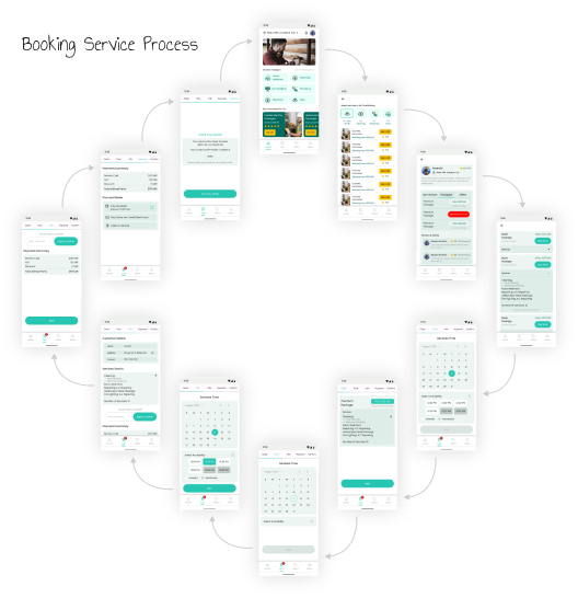
Flow Diagram: Booking Air Conditioning Service Package – Air Cleaning In Advance
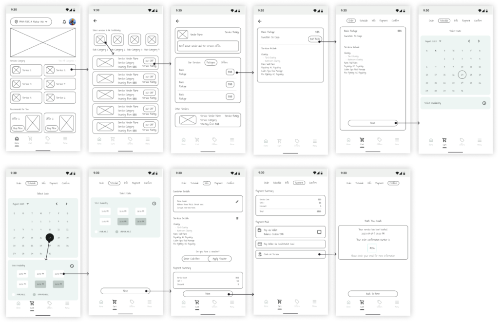
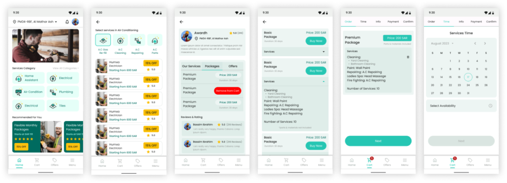
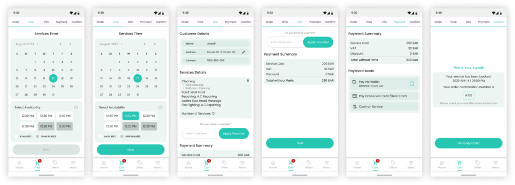
Wireframes: Booking Service Package
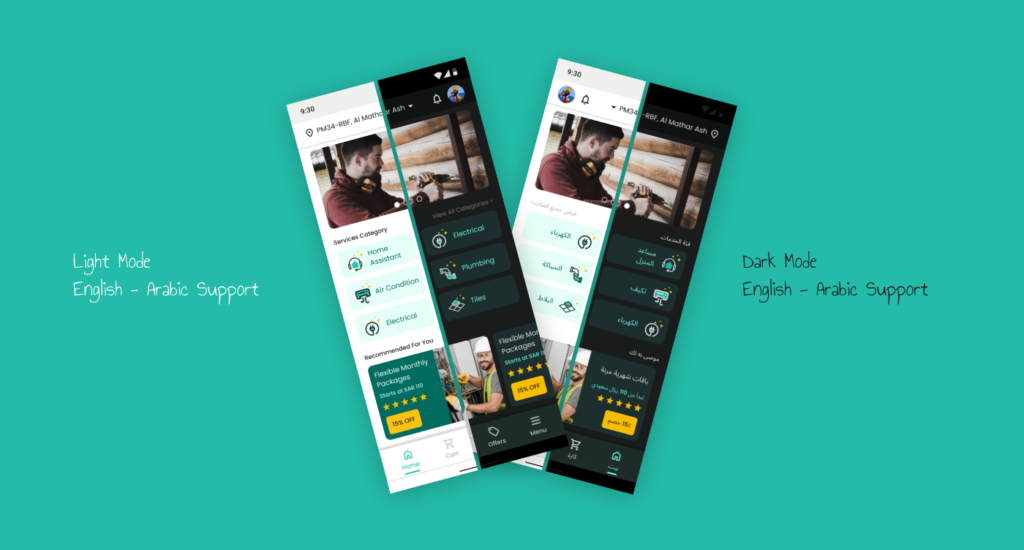
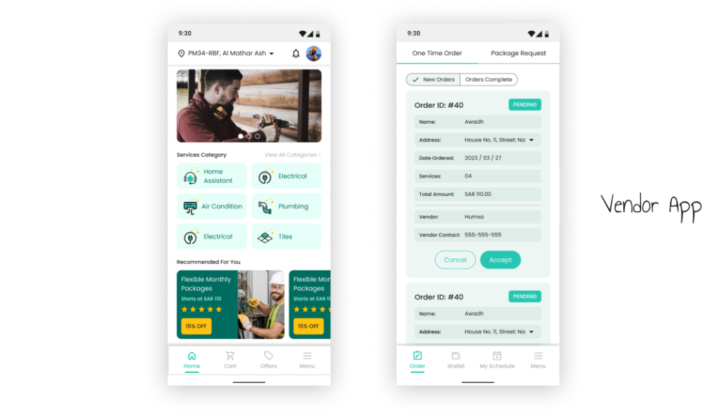
High-fidelity UI Design
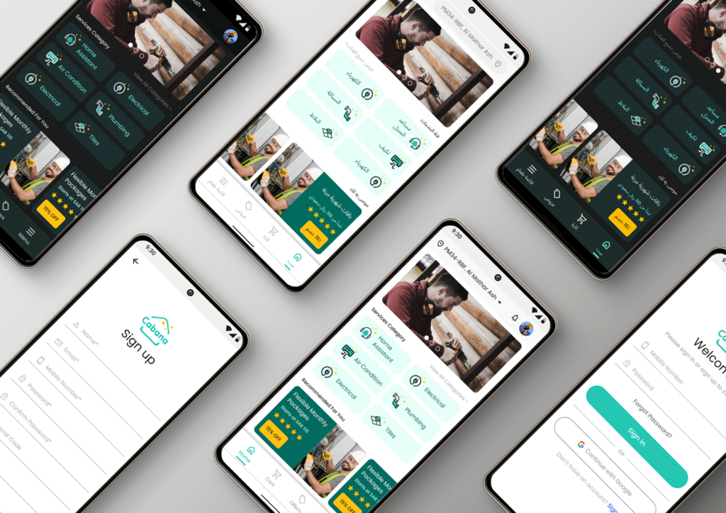
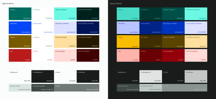
Once the initial flow was completed and wireframes were ready, I started creating a couple of the main screens of the app. Choosing a type face and a set of colors were the two most important things. I created a simple UI Style Guide to maintain a consistency. Thus for colors I went with Material Design Colors Guide. Then I created a typography scale to ensure that the hierarchy throughout the project is preserved.
Typography – Poppins
Aa Bb Cc Dd Ee Ff Gg Hh Ii Jj Kk Ll Mm Nn Oo Pp Qq Rr Ss Tt Uu Vv Ww Xx Yy Zz
1234567890!-_?/()

High-fidelity Prototype
Prototype Testing
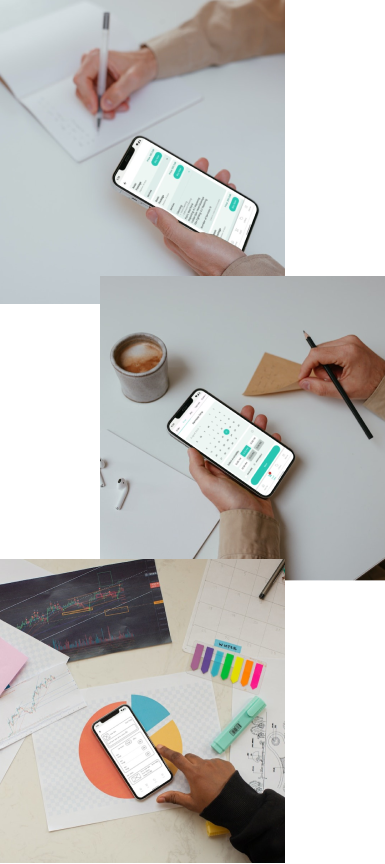
After the prototype was created I tested on the 5 users. I made a research plan where I outlined the research goals, questions I wanted to know the answer from, KPIs, methodology, information about the participants, and a scripts with tasks to complete.
Mainly I wanted to sure that the booking a services process is smooth without any friction and leads to the packages being purchased. This was tested and carried on in-person using Figma’s prototype mirror share app.
USABILITY TEST: TASK
- Add one service and then add multiple into cart.
- Book a service package in advance for a next whole week and add it into cart.
- Proceed to checkout screen and completing.
Study Result
All of the participants were able to complete task 1 (adding one service and then add multiple services into cart. However, only 1/5 users were able to complete task 2 (booking a service in advance for a whole week). It bring into the attention that the process iteration were either misleading to the user or the next step was completely missing or the user were unable to figure out what to do next.
Project Summary
During the project, I managed to evaluate the market research, do a quick user survey, create a low-fi wireframes, built them into hi-fi UI designs, connect them into prototypes, and perform a mini usability study. In testing I discovered the process frictions, update the concept and then re-test it successfully.
It was a challenging and time consuming journey but very insightful and the career lesson experience. But I still believe there is a lot that can be improve overtime and so I am not resting on my laurels because there is still a lot to learn.

